A digital elevation model (DEM) covering all six counties was used to determine the flow direction within the Cuyahoga River watershed using the ArcGIS 10.1 program. The hydrololic modeling tools found in the ArcToolbox under Spatial Analyst Tools was used. First a depression-less DEM was created using the Fill tool in ArcGIS. The Fill tool removed any imperfections, or sinks (a cell that does not have a defined drainage value associated with it) in the Digital Elevation Model. All cells with internal drainage, which may represent errors in the data set, were filled. To determine the direction that water will flow from a particular cell of the DEM, a flow direction grid (Figure 2) was created to determine the ultimate destination of the water flowing across the surface of the landscape.
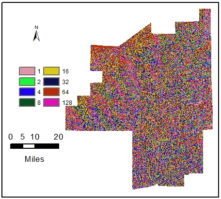
Figure 2 – Flow direction grid
|
Figure 3 – Flow accumulation
|
The flow into each cell was accumulated by using the Flow Accumulation tool which calculates the cells that flow into each downslope cell. Each cell's flow accumulation value is determined by calculating the number of upstream cells that flow into it (Figure 3). The stream to feature converts a raster representing a linear network (in this case the flow accumulation) to features representing the linear network (Figure 4).
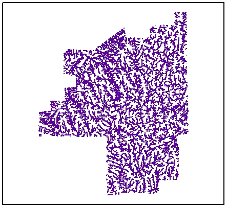
Figure 4 – Raster representing linear network
|
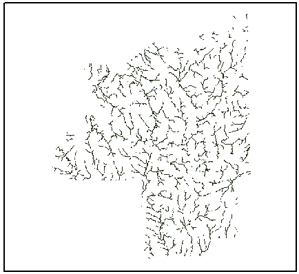
Figure 5 – Stream network output
|
The Con tool was used with a threshold of 5,000 meaning that 5,000 was the value chosen to determine which cells are part of a stream network, and which are not. This threshold means that a cell is part of a stream network if there are at least 5,000 cells that contribute water to it (Figure 5). Pour points were created at areas of high flow accumulation by digitizing the points at the main tributaries. These points (Figure 6) calculate the total contributing water flow to that given point. Using these pour points and the flow direction raster created, the Watershed tool determined the contributing area above a set of cells in a raster. The output was a map showing the Cuyahoga watershed which was clipped out to be used as the study area (Figure 7). The delineated watershed was overlaid with the other data variables to clip out the extent of the study area for further analysis.

Figure 6 – Pour point selection
|

Figure 7 – Boundary of the watershed
|
The following is a flowchart that showed the processing to generate our study area.

IMPERVIOUS SURFACE ANALYSIS
Using the Reclassify tool, the impervious surface area data was divided into four ranges based on the percentage of each pixel that was impervious. Each range was assigned a value from 1 to 4 based on how severely they contribute to runoff. For instance, 1 was assigned to areas with less than 20% imperviousness. Table 1 shows the old value ranges and the new values they were assigned.
Using the Reclassify tool, the impervious surface area data was divided into four ranges based on the percentage of each pixel that was impervious. Each range was assigned a value from 1 to 4 based on how severely they contribute to runoff. For instance, 1 was assigned to areas with less than 20% imperviousness. Table 1 shows the old value ranges and the new values they were assigned.

Table 2 summarizes the four ranges, which have been reclassified into ranges as categorized by the USGS. A higher percentage of impervious area would result in more runoff, and was assigned a higher number accordingly.

LAND COVER ANALYSIS
The land cover data was classified into eight types according to the USGS Land Cover Classification Legend(Fry, J., Xian, G, 2011). For example, all values/class beginning with the number 1 is water/perennial ice/snow (Anderson Classification System) as summarized in Table 3.
The land cover data was classified into eight types according to the USGS Land Cover Classification Legend(Fry, J., Xian, G, 2011). For example, all values/class beginning with the number 1 is water/perennial ice/snow (Anderson Classification System) as summarized in Table 3.

For the purposes of this study, we reclassified the eight types into four categories by grouping similar land cover classes into the same category. These are summarized in Table 4 along with the assigned value for this study.

POPULATION ANALYSIS
The population data provided the number of people and area (square feet) of each census tract. We calculated the population density of each census tract by taking the number of people divided by the area of each census tract and then converting to square miles. The data was classified into four ranges to correlate with the other data inputs. The figure below shows the census tracts in the watershed area and the associated attributes table
The population data provided the number of people and area (square feet) of each census tract. We calculated the population density of each census tract by taking the number of people divided by the area of each census tract and then converting to square miles. The data was classified into four ranges to correlate with the other data inputs. The figure below shows the census tracts in the watershed area and the associated attributes table

|

|
figure 8
Using the “popDEN” field from the attributes table, the ranges were chosen based on natural groupings inherent in the data. Class breaks were identified that best grouped similar values that maximize the differences between classes. The data/features were divided into classes whose boundaries are set where there are relatively big differences in the data values. Table 5 summarizes the population density data.

Each range was assigned a value to relate how population density affects runoff. A higher population density would result in more pollution, and was assigned a higher number of four accordingly. Previous studies suggested that, the higher the populations more greatly the impact on the water quality of watersheds (Zhang Wei et al. 2013). The population layer was converted to a raster dataset since the algebra equation (which would be used in our next step) is only compatible with raster layers (Figure 9).
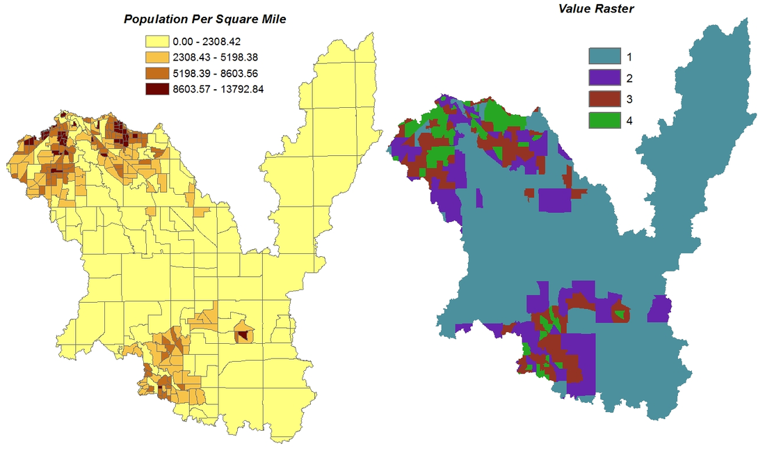
figure 9
RUNOFF POLLUTION POTENTIAL EQUATION
A variable weighting scheme was applied to each variable before summing the assigned value of each pixel to determine overall runoff pollution potential. The following weights were used: impervious surface layer 50 percent, land cover 30 percent, and population density 20 percent. Previous studies have demonstrated the strong link between impervious surface and runoff (Dougherty et al., 2004; Bauer, Doyle, and Heinert, 2002 and Arnold and Gibbons, 1996), thereby assigning it the highest weight. Moreover, there is increase in new amounts of impervious surfaces whenever a region develops. The equation was written out with the Map Algebra tool which multiplied the value of each pixel by the specified co-efficient assigned to each layer. This calculated the runoff pollution potential as follows:
i = (0.5 x ISA) + (0.3 x LC) + (0.2 x POP)
where:
ISA = Impervious Surface Area layer
LC = Land Cover layer
POP = Population Density layer
i = runoff pollution potential of each pixel
